Introduction
A World Exposition or ‘Expo’ is an international public exhibition held once every 5 years. This tradition began in 1851 with the Great Exhibition, housed in Joseph Paxton’s Crystal Palace, in London. World Expos attract millions of visitors with their array of pavilions, events and exhibitions. The 2015 Milan Expo brings together 145 participating nations under the theme “Feeding the Planet: Energy for Life” from May – October 2015.
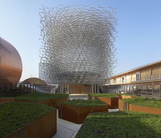
The UK Pavilion highlights the decline of the world’s bee population focussing attention on the importance of pollination for food production. Visitors meander through an orchard, discover a wildflower meadow and enter ‘the Hive’, a sculpture which glows and hums, simulating conditions in a real beehive. The Pavilion reinterprets apiarian ecology as an immersive multisensory experience – a beautiful and profound encounter – leaving visitors with a lasting flavour of the British landscape.
The Pavilion was designed by Nottingham-based artist Wolfgang Buttress in collaboration with engineer Tristan Simmonds and Manchester-based architectural practice BDP, who together comprised the competition-winning team. The Pavilion was fabricated by Yorkbased firm Stage One. Audio-visual and messaging components were created by Squint Opera. The Pavilion has been an extensive multidisciplinary effort, with each profession working in close collaboration towards the realisation of the whole.
Concept
Bees are very sensitive to their environment and can be seen as ecological sentinels: a barometer for the health of the earth. Responding to the Expo theme, we have chosen to focus on a vital and often neglected part of the food picture: Pollination is an essential process, underwriting at least a third of our food production. Yet the honeybee, an important pollinator, is in crisis. We have witnessed massive declines in global bee populations over the past decade. The UK has seen an overall decline in bees of 30% between 1986 and 2005, while in Italy the decline has been over 40%. Recently, EU research revealed that 29% of British honeybee colonies died-out in the 2012/13 winter, an unprecedented loss. This trend is the result of a combination of factors including pesticides, disease and loss of habitat. Since the 1950s the UK has lost around 97% of its wild meadows to building and agriculture.
The UK Pavilion focuses on the need to address these problems and the importance of sustaining ancient ecological mechanisms which we have evolved within and rely heavily upon. The designers teamed-up with bee expert Dr. Martin Bencsik who is undertaking cuttingedge research using technology to better understand the behaviour of honey bee colonies. By measuring vibrational signals Bencsik can determine the condition of a colony and predict swarming, which is a significant step forward. Such research will aid the task of bee keeping through development of new monitoring technology. This in turn could form part of a wider strategy to support the bee, bringing great benefits in terms of food security, ecology and economy. This issue is of particular importance to the UK as our bee population is among the worst affected in the world by the recent downward trend. At the same time there has been something of a renaissance of interest in bee keeping with many people taking up amateur rooftop bee keeping.
The future of bee keeping is being revitalised in localised ways, and new advances in technology could assist in this. The overall vision for the UK Pavilion comes from an artist’s sensibility. It seeks to connect the visitor with nature and ecosystems on an experiential level. The design builds upon Wolfgang’s previous work, extending this into new territory. The project evolved though many iterations of design, guided by the chosen angle and underlying theme. The design team were given a virtual carte-blanche to design around a theme and visitor experience. The a-contextual nature of the brief called for something self-contained and coherent in its own right. The team’s initial response to this undefined condition was to create a new context: to graft a slice of the British countryside onto the site in Milan. A sequence of key areas including, an orchard, meadow, terrace-bar and the focal ‘Hive’, together comprise the visitor journey. The experience is intentionally entirely external and is intended to be quiet, almost subliminal. The Hive is set back from the entrance, creating distance and serving as the culmination of a journey through the landscaped areas. The Hive may be glimpsed from the main ‘Decumanus’ Expo thoroughfare generating intrigue and inviting visitors to enter and discover. The meadow is raised to eye-level giving a kind of ‘bees-eye view’ of the wildflowers.
The aim is to impart a sense of being within nature, to foster a sense of empathy, humility and connectedness. Multiple routes and places allow the visitor to explore and participate in the curation of their own journey. The experience is deliberately non-prescriptive, based on the premise that an experience is most insightful when people actively engage. This principle has informed many aspects of the Pavilion. Use of the senses was also key, engaging the olfactory, haptic and aural as well as the visual faculties.
The Hive
The Hive is an abstracted analogue of honeycomb, exhibiting radial hexagonal geometry in plan. The structure is an open lattice, forming a sense of enclosure while maintaining a dialogue with the surroundings. A rotational twist in the structure introduces movement, suggestive of a swarm. The form is a 14m cube raised-up on columns, appearing almost to hover above the meadow. A spherical void is hollowed from the centre, allowing visitors to enter. Walking beneath the sculpture, visitors may peer up through the glass floor, into this void and watch others swarming around inside. The hexagonal pattern cannot be clearly understood from afar, the visitor must come upclose to discover this organising principle. There is juxtaposition between the pure Euclidian volume of the sculpture and the filigree character of its structure. In this way, contradictions between notions of nature and artifice, simplicity and complexity, order and chaos, are conceptually synthesised.
The degree of abstraction allows the sculpture to engage on a number of different levels, leaving space for subjectivity and interpretation. Our central idea was to employ Dr. Martin Bencsik’s research techniques to connect a real bee hive in the UK to the Pavilion in Milan. The vibrational activity of a beehive in Nottingham is measured using accelerometers. These signals are streamed in real-time to the Pavilion in Milan. The high-dimensional data signals are analysed and decoded using a Fourier spectra averaged on different time scales. These distilled signals are expressed via an array of individually-addressable LEDs, which line the interior void space within the sculpture, causing it to glow and pulse.
This visual experience is complemented by audio, implemented using a surround-sound system. The soundscape is based on pre-recorded harmonious stems crafted by an ensemble of eminent musicians. These stems are triggered at particular thresholds and noise-gates by the live-streamed bee-signals. The result is a kind of symphony between bee and human. Throughout this soundscape the listener will hear a series of gentle, very short vibrational pulses. These include eight specific communication signals used by honey bees, never before used within a musical composition. At each instance the experience is unique and changing, no two moments are the same. The Hive acts as a medium or interface, conveying the activity of bees directly to the visitor at that specific point in time.
Structure
The Hive consists of 32 horizontal stacked layers of hexagonal geometry. This pattern has a rational underlying order and employs rotational symmetry. The geometry was resolved into alternating layers of radial and circumferential elements. The pattern of radial and circumferential lines is analogous to the flow pattern of stress and so defines horizontal lines of structure. The layering of the sculpture allows these radial and circumferential lines of structure to be joined to form truss like assemblies. This repetition within the hexagonal pattern allows the truss assemblies to provide repetition on the macro scale. The bottom and top chords of each truss are cut from strips of flat plate to emphasise the horizontal layering of the sculpture while the brace elements joining the top and bottom chords are, in contrast, small tubes or bars.
Connections were made mechanically using a machined node. The structure is fully-braced, which helped reduce material and meant that connection nodes didn’t need to resist bending. In an attempt to achieve a level of optimal efficiency (as encountered in nature) and thereby produce a filigree and delicate structure we proposed that each individual component i.e. segment of plate, tube or bar within each truss would only be as wide as it needed to be, producing variation at the micro scale. Each truss, although based on a macro repetitive geometry, would also have to be individually trimmed to the internal and external surfaces. The trimming combined with the varying sizes of the component parts, made every one of the 1000 or so trusses potentially unique. It was resolved that the Hive was going to have many tens of thousands of possibly unique parts. These parts would have to be individually sized to carry the forces experienced under a hundred different combinations of loading.
It was also conceded that the Hive would need to be re-designed over and over again and it would need to happen in a short amount of time, a quick digital Darwinian process. The process could only be achieved by writing software. We assumed that every task in the design would have to be carried out time and time again and so each task was automated as much as possible. Eventually a complete re-design involving detailed analysis models, design code checking, structural optimisation of 70,000+ elements and outline drawings could be turned around in a few days. On a conventional project this can take months and typically only happens once. This ability to change and test the design quickly meant that the design could adapt to extreme events including a complete change in material from stainless steel to aluminium, new geometries to accommodate changes in connection design and multiple complete redesigns to achieve savings of 20% at a time.
The design information when finally fixed was used to generate 1,500 individual solid CAD models containing over 30,000 individual parts fully detailed for fabrication. The contractor, Stage One was then able to take these models and process them through their existing 3D workflow and management system to supply to their CNC machines for fabrication. The Hive is constructed from a total of 169,300 machined aluminium components. The Hive is a modular structure, a kit of parts, made in the UK and then shipped to Milan for assembly on site. The intention is for the Hive to have a ‘second life’ back in the UK and this was designed in, as a key principle from the outset.
Landscape
In response to the difficulties that bees face, we proposed a wildflower feast for pollinators, providing a space for this crucial mechanism at the Milan Expo. The landscape forms a core aspect of the UK Pavilion, covering around 60% of the site area. Planting is a natural foil to the precisely-engineered Hive sculpture which forms the focal point of the Pavilion. We sought to transport the visitor into the world of the honeybee, creating a journey through archetypal British landscapes.
The journey begins in an Orchard area with apple trees (dependant on pollination by bees) under-planted with a carpet of shade-tolerant wildflowers. The Orchard is bounded on twosides by timber panelled walls, the ‘information wall’ and ‘swarm wall’. These play host to a swarm-like array of small holes, evocative of a swarm and in reference to ‘bee hotels’. The visitor then moves through a narrow transitional space, evoking notions of the ‘secret garden’, before emerging into a rolling wildflower meadow. In plan, the meadow paths continue the hexagonal motif of ‘the Hive’ sculpture, sited at the far end, which seems to radiate into the landscape, informing routes and layouts. An inlay set into the floor makes this connection explicitly. A more formal planting strip, the ‘BE Fringe’, runs around the perimeter. This planting consists of different lavender species, evocative of the English country garden and Earl Grey tea.
Lavender is also a favourite of bees. Planting within the meadow is designed as a rich tapestry of types, merged into one seamless, undulating landform. Varying topography is accentuated using swathes of textured grasses and tall perennials. To achieve this, a single pre-sown wildflower turf was laid throughout the meadow, into which plug plants were inserted, creating different character areas. Plant species were selected for their richness in nectar and seasonal interest: the Cat’s Ear (Hypochaeris radicata), for example, with its large yellow flowers reaching for the sky, the Field Scabious (Knautia arvensis) with its delicate pom-pom-like lavender coloured flowers, and the Red Clover (Trifolium pratense), with its abundance of lower growing, ball-like magenta flowers. These, and all the other species used, were chosen in collaboration with Kew Gardens, who brought the wealth of their expertise to the project.
The planting is seasonal and will change throughout the six month duration of the Expo. Part of our agenda is to showcase this cycle and cultivate an appreciation of the charms and character of the different stages. The scheme focuses on the performative aspects of planting, that is, the ecological usefulness of certain types of plants for a specific need. The landscape serves as a representation of the project manifesto and serves as an example of the type of planting that can assist in creating nutritious habitats to sustain the vital pollinators. Many bees have been seen visiting the meadow during the opening month alone.
Architecture & Interiors
The architecture of the terrace-bar and conference suite beneath, is unapologetically solid and understated, minimal in the detail. A common 900mm module is set to provide a natural rhythm throughout the building, with smaller modules being subdivided, setting stair treads and risers; window opening sizes; door ironmongery heights and cladding panels, all linked back to a unifying order, a nod to the efficient ordering of honeycomb.
Within the building, a single hexagonal cell is positioned centrally, with the internal planning developed around this. It provides a multifunctional space through which temporary exhibitions can be held, business meetings attended or conferences presented. Careful planning allows support spaces to cluster, but remain independent to meet functional requirements, making efficient use of the limited area. Careful consideration was given to adjacencies, user flow and the distribution of private and public spaces and routes. Multiple separate entrances are provided for public, office staff, kitchen staff, VIPs as well as stock delivery and waste removal.
The building provides obvious markers for users internally and a counterpoint to the lightness of the sculptural Hive externally. The external facade treatment is monolithic, with high-level window openings positioned behind perforated Corten steel cladding, and at low level, behind mirrored louvered panels, so as to minimise the impact on the visitors' quiet impression of a unified whole. A similar approach is taken with the bar, which greets visitors as they emerge onto the rooftop terrace en-route to the Hive. A heavy roof plane covers the bar area providing shelter from the elements, with a mirror-like metallic finish focusing the experience back towards the Hive and the landscape beyond.
Materials
The materials used are generally unprocessed and will patinate naturally. This rawness was a key principle. Once built, the weather takes over and the materiality of the pavilion continues to evolve. Weathered Corten steel has a rustic earthy hue, contrasting nicely with the delicacy of the planting and Hive structure. Warm metallic mirror finish gives the impression of greater depth connecting various areas through reflected glimpses. Louvered walls reference the traditional beehive. Plywood and Douglas fir bring softness and will silver over time. The floor treatment is resin-bound gravel throughout, creating a kind of crunchy feel, like walking across stony ground. Aluminium was selected for the Hive for many reasons: it is lightweight with favourable structural properties, cost, is corrosion resistant and can be machined easily.
Lighting
Due to the low levels of animated light in the centre of the Hive, the lighting designers took care to reduce ambient light levels and minimise glare. This is achieved through luminaires integrated within details, ensuring that visitors’ eyes adapt as soon as they arrive. The Pavilion has various functions and the lighting design ensures that the systems for the bar, dining and conference spaces, together with the wayfinding and emergency lighting, integrate seamlessly into the overall vision.
One major decision, that was taken early on, was to light all details in a consistent, very warm white light to support the honey metaphor associated with the Hive. This also ensures that the light and tones of the space are reinforced and not countered by colour opposition. Entering the Pavilion, the orchard’s pathways glow gently leading to the meadow where a series of trees are uplit and visitors are guided past a busy ‘swarm wall’ emanating a slight sparkle. Visitors move along the meadow pathways, all lit from a low level skirting detail.
Below the hive deep recessed, low glare adjustable spotlights provide pools of light to aid the reading of brochures and offsetting the drama of the animated Hive overhead. A seamlessly integrated LED handrail leads up the stairs to the bar area. The detail continues around the upper terrace space to provide a low level background ambient illumination. Recessed within the floor of the bar is a glowing honeycomb feature motif. Inside the heart of the building lies a decorative beehive-inspired lighting installation. This is a show space for dining, conference and exhibition, and the installation offers a variety of flexible lighting for each.
An array of hexagonal aluminium extrusions are scattered in small clusters over the ceiling, each providing a warm white glow with a slight sparkle.
Messaging
The pavilion contains an informational aspect with messaging about the bee. In the orchard area, the ‘swarm wall’ exhibits an informational animation about the bee, on an array of small screens embedded within the wall, and describes the concept behind the Pavilion. There are other such elements which the visitor must discover, such as hidden screens, messages and pull-out slides. There are also a number of ‘bone conduction’ points. These are devices which visitors can connect to with a wooden straw. These transfer sound, not through the air, but through the listener’s jaw bone. Honeybees communicate through vibration rather than air-borne sound. The approach was to allow visitors to discover these things for themselves, encouraging a sense of mystery and playfulness.
Construction
Most elements of the Pavilion were fabricated in York and then transported to the site in Milan for assembly. Parts for the hive were machined and water-jet cut. This kit of parts was sent to Milan in batches and assembled layer by layer. Most of the build followed this strategy of off-site preparation with just-in-time delivery to site for install. The contractor had to confine construction within the boundaries of the plot, so this approach made a lot of sense. Despite challenging timescales the Pavilion was completed on time, ready for the Expo opening on 1st May 2015.
Conclusion
The environmental and economic problems facing humanity are varied and significant. The scope of a pavilion in this context is necessarily limited. In this case we’ve selected the decline of the bee, which is a particularly compelling and relatable example of a wider problem. The Pavilion’s main function is awareness, to send out ripples. If people take these messages to heart -the importance of biodiversity, our co-dependence with other ecosystems- if people learn something new, discover a message or insight; if people come away inspired or otherwise motivated to act, to change, or to find out more… then the Pavilion will have achieved something towards this wider objective.
Credits
Artist and creative lead: Wolfgang Buttress
Pavilion manufacture and production: Stage One
Structural engineers: Simmonds Studio
Architecture, landscape architecture and environmental engineering: BDP
Physicist and bee expert: Dr Martin Bencsik
The Building Centre is a UKTI accredited trade organisation. Working with UKTI we help to promote and support UK businesses overseas. The Tradeshow Access Programme (TAP) offers grant funding for eligible businesses to attend oversea trade shows, for more information see https://www.gov.uk/tradeshow-access-programme


