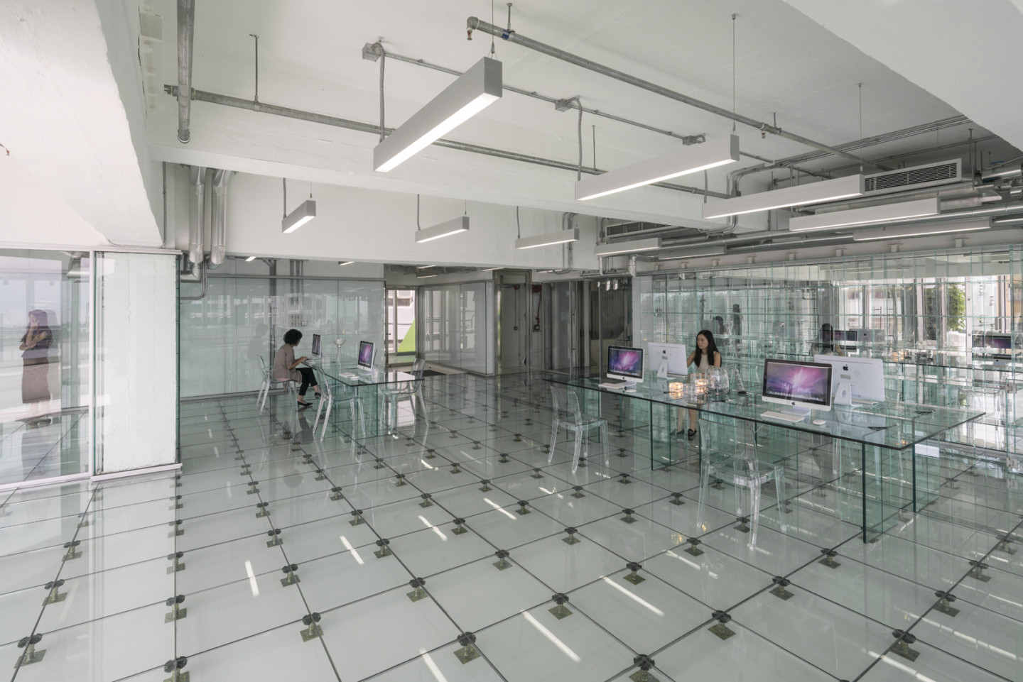
With floor area at a premium in Hong Kong MVRDV aimed to create an office space which offered maximum attractiveness and perceived spaciousness in order to provide as pleasant working environment as possible. The building is stripped down to its beautifully raw and butch primary structure, with all unnecessary trimmings being taken out. Infill was only then added to the building in the form of white paint, glass and stainless steel in order to maintain and highlight the purity of the bare structure. Old and new are easily distinguished, whilst the inner workings of the building are on display for all to see. But how to create an office environment that also brings with it the purity and simplicity of the building design? The answer, glass tables, shelves, floors, speakers, computers, walls – an entirely glass office, free from visible clutter. The model office stands as an example for tenants to install in their work spaces if they desire.
“We are moving into a transparent society, businesses are becoming more open with the public, and people care more about what goes on behind closed doors. In that way, a clear workspace leaves nothing questionable, nothing hidden; it generates trust.” Tells MVRDV co-founder Winy Maas, “But also it is an opportunity for the building to become a reminder of the industrial history of the neighbourhood, monumentalised in a casing of glass.”
133 Wai Yip Street takes a new approach to development in Hong Kong, reusing the existing building and reinforcing the area’s original character rather than wiping the slate clean with solely new builds. The goal was to expose the inner workings of the building including the structure and installations, but not only this, to show the free-flow movement within the building, the inner-workings of the companies inside and the technical components which allow the office to function. Glass lifts in glass shafts reveal everyone’s movements up and down the building; even the fire-stairs are encased in fire-resistant glass.
The lower floors reactivate the public domain through adding a different programme. The ground floor comprises of retail, whilst the two floors above this are reserved for restaurants. A rooftop space, as well as balconies on each floor, gives residents of the building access to the outside; ideal locations to appreciate the views out onto the waterfront.
The former building closed itself off from the street behind with rendered and tiled concrete walls and tiny windows. In order to humanise the surrounding area and create a more approachable environment on all sides, the rear façade has been stripped back and replaced with glazing. Through doing this the communal areas and vertical circulation of the building are exposed, giving pedestrians an insight into the happenings of each office and the movement of those inside.
The previously dark and labyrinth-like insides have been completely stripped out to open up the programme and allow light to flow through the building. Communal areas, services and vertical circulation have been moved towards the rear of the building. The floor plan now allows for each floor to either be occupied by one tenant, or for them to be separated into as much as four separate work spaces through the addition of light, glazed infill.
Despite large amounts of glass elements, the building has a 17% lower annual energy consumption as well as a 15% lower peak electricity demand compared to average offices in Hong Kong. MVRDV began work on the project in April 2013 and have since worked in partnership with co-architects Arch-Innovativ.
The Glass Office is, for now, MVRDV’s last project in an ongoing exploration into the alternative uses of glass in architecture. Previous projects include: the Markthal, with 40 x 40 metre windows; glass farm, with printed glass as a monument to local history; Crystal Houses in which a historical façade was constructed out of Venetian glass bricks; and the Infinity Kitchen at this year’s Architecture Biennale in Venice, that offered a provokingly anti-cyclic vision to the theme “reporting from the front”, in which the celebration of food plays a vital role.
Architects: MVRDV
Design team: Winy Maas, Jacob van Rijs and Nathalie de Vries with Renske van der Stoep, Wenchian Shi, Martine Vledder, Arjen Ketting, Kyo Suk Lee, Edwin Veth, Gerard Heerink, Ting Wen, Nicolas Lee, Jason Slabbynck, Matias Thomsen, Matteo Artico, Emilie Koch, Arian Lehner, Sanne van der Burgh, Mikel Vazquez and Klaas Hofman
Co-architect: Arch-Innovativ
Structure: Technik (HK) Ltd.
E & M: Engineering Consultants Ltd
Cost advisor: Levett Bucknall
Property manager: CBRE
Surveyors: Raymond Chan Surveyors Limited

.jpg?1465302987)
